
The Green Thumb

Overview
As wonderful as houseplants are, both for your health and your décor, it can sometimes seem that houseplants just love to die—especially if you’re relatively new to indoor gardening. Perhaps worse yet, in many cases, gardeners are mystified by exactly why their beloved plant died.
The good news is that plants really don't just die without reason. In fact, houseplants are fairly predictable, depending on their species, and the vast majority of houseplant casualties are all caused by the same few factors. Those including, but not limited to, watering, light requirements, and humidity.
Problem Statement
How might we improve the experience of keeping houseplants alive with an emphasis on education and routine?
Solution
With the Green thumb you can set up reminders for plant care, and search information about your plants.

.png)
Primary Research
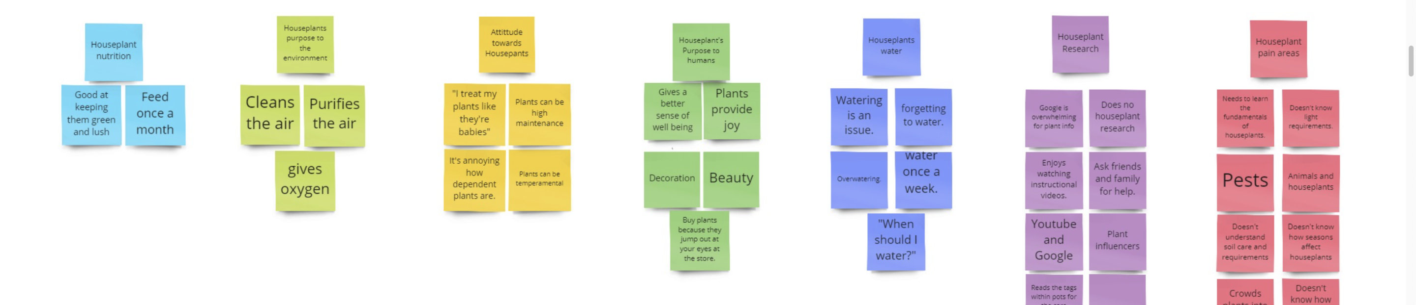
I created a one page research plan that summarized how I intended to learn about user needs and pain points with houseplants. I then created user surveys to screen my potential participants, and lastly conducted 5 user interviews. The key takeaways from user interviews are that participants don't have a fundamental understanding of houseplant anatomy, nor do they understand their home environments in relation to the plants needs.
Secondary Research
I generated secondary research to understand gardening in a extensive way that would allow me to apply science based solutions. I summarized the findings in 11 different research studies from University Horticulture programs. The main focus areas included plant nutrition and irrigation, home environment (light, temperature, humidity), and pest management.
Competitive Research
I conducted competitive research to Identify my competitors and evaluate their strategies to determine their strengths and weaknesses relative to my own product. In summary, I learned that plant apps didn't have an online community, sequential ordering of their plant knowledge, or video tutorials to watch plant care.
Target Audiences
Homeowners
Struggle to:
Understand the difference between outdoor gardening and indoor gardening.
Because:
They’re more prone to have skills in outdoor gardening and assume the skills and conditions are the same indoors.
Instead:
Enable them to understand light, temperature, and humidity conditions within their homes with plant education.
Renters
Struggle to:
Monitor and take accountable steps on ways to care for their plants consistently
Because:
They don’t have the tools to inform them on how to care for plants within their homes.
Instead:
Enable them to track their plant care and research information about their plants.
The Busy Millennial
The Busy Millennial is the first persona, and 3 out of 5 interviewees fit under this category. I referred back to this design persona when designing the features. The "Busy Millennials" said they absorb information best through videos. So I developed a section of the app that shows plant care tutorials. Also the plant care log feature helps them to remember when they performed an activity and to set a reminder for next time.
.png)
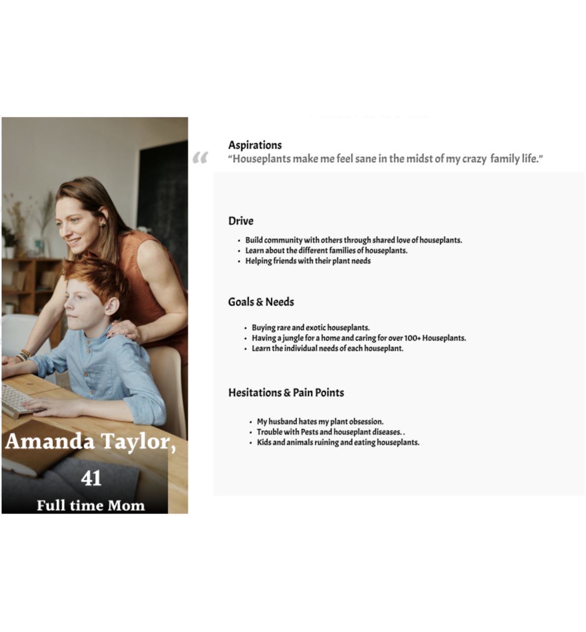
The Full-Time Mom
The "Full Time Mom is the second User Persona that I created, and 2 out of 5 interviewees fit under this category. I referred back to this persona when including a explore section, to help inspire new ideas. As well as, having the plant search feature including more than just plant information but information on pests, plant and animal tips, and product recommendations.
For both personas, creating a log In section helps to create a sense of community amongst users, to comment, share, and exchange houseplant ideas.
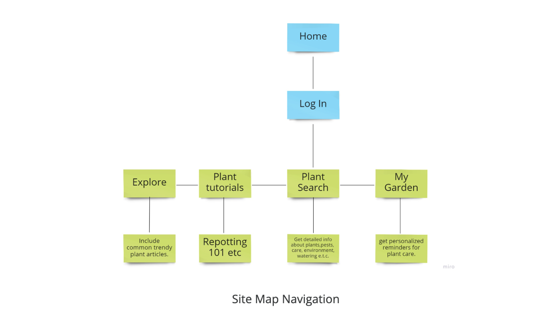
Site Map
Using the insights of my User Personas, I then created a Site Map. This Site Map is a rough landscape of my features. It allows me to get a gist of what the Informational architecture will look like. As well as, see potential issues of navigating the App.
Sketches
After getting an understanding of my information architecture I began to sketch screens. This helped me to understand whether my ideas were tangible before moving on to wireframing.

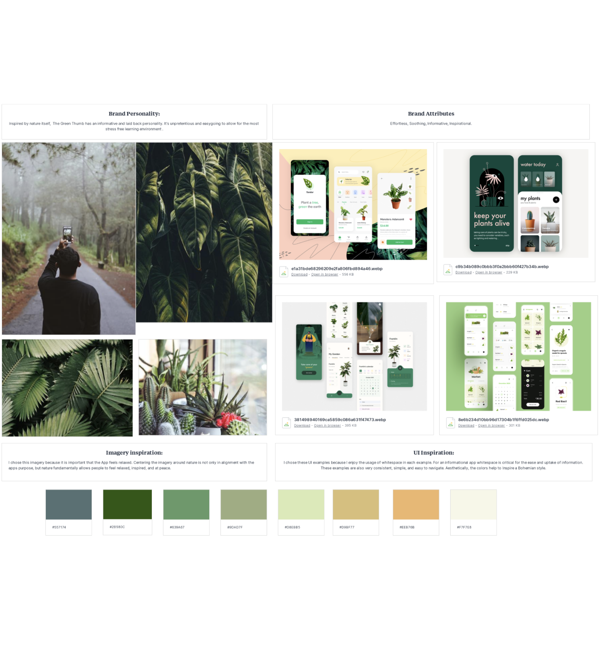
Moodboard
After sketching screens, I created a mood board to guide the visual aesthetic I wanted to use to help inspire creativity as I designed the UI of The Green Thumb. I wanted the aesthetic established by my mood board to directly reflect the brand personality and brand attributes of the green thumb to curate a cohesive user experience.
Low Fidelity Wire Frames
Using my sketches I made 46 Low fidelity wire frames for 3 main red routes that a user would experience on The Green Thumb.
Those being :
- Searching Plants or Pests
- Searching for Plant Care Tutorials
- Adding new plants to your plant Log
Making Low-Fidelity wireframes helps me experiment with pixels, fonts, and icons before moving on to pixel-perfect Hi-Fidelity Designs.

Usability Testing
Moderated Usability Testing
Usability testing is a critical phase in the design process as it provides crucial information about both design and function. Using moderated remote interviews, participants were asked to complete specific tasks using the developed prototype.
The primary goal here was to look for areas of confusion, to solve for any errors that might have been overlooked, and to gather feedback for usability improvement.
Users were asked to complete tasks specific to each Red Route:
- How would you search for a plant?
- How would you find a plant tutorial?
- How would you Add to your Garden?
Users were asked to complete tasks specific to each Red Route:
- What was most confusing about the app?
- What do you like most about the app?
In the end, I culminated with a SUS score of 72 and prioritized my findings with a Usability Error chart that listed Major, Minor and Normal errors to fix.