
Classification Creation and Mapping
Overview
Classification routing is a complicated process. It's the internal and technical process that allows patients to be routed to the correct services. I was tasked with designing an experience that allows you to create and map classifications in a hierarchal fashion to properly route patients to the correct service. As an internal Admin user, they needed to be able to easily create, edit, and disable classifications and view all settings so that they can easily address customer questions or report issues related to Classification Hierarchy.
Problem Statement
How might we design a configuration within the admin experience that smoothly routes patients to the right services?
Solution
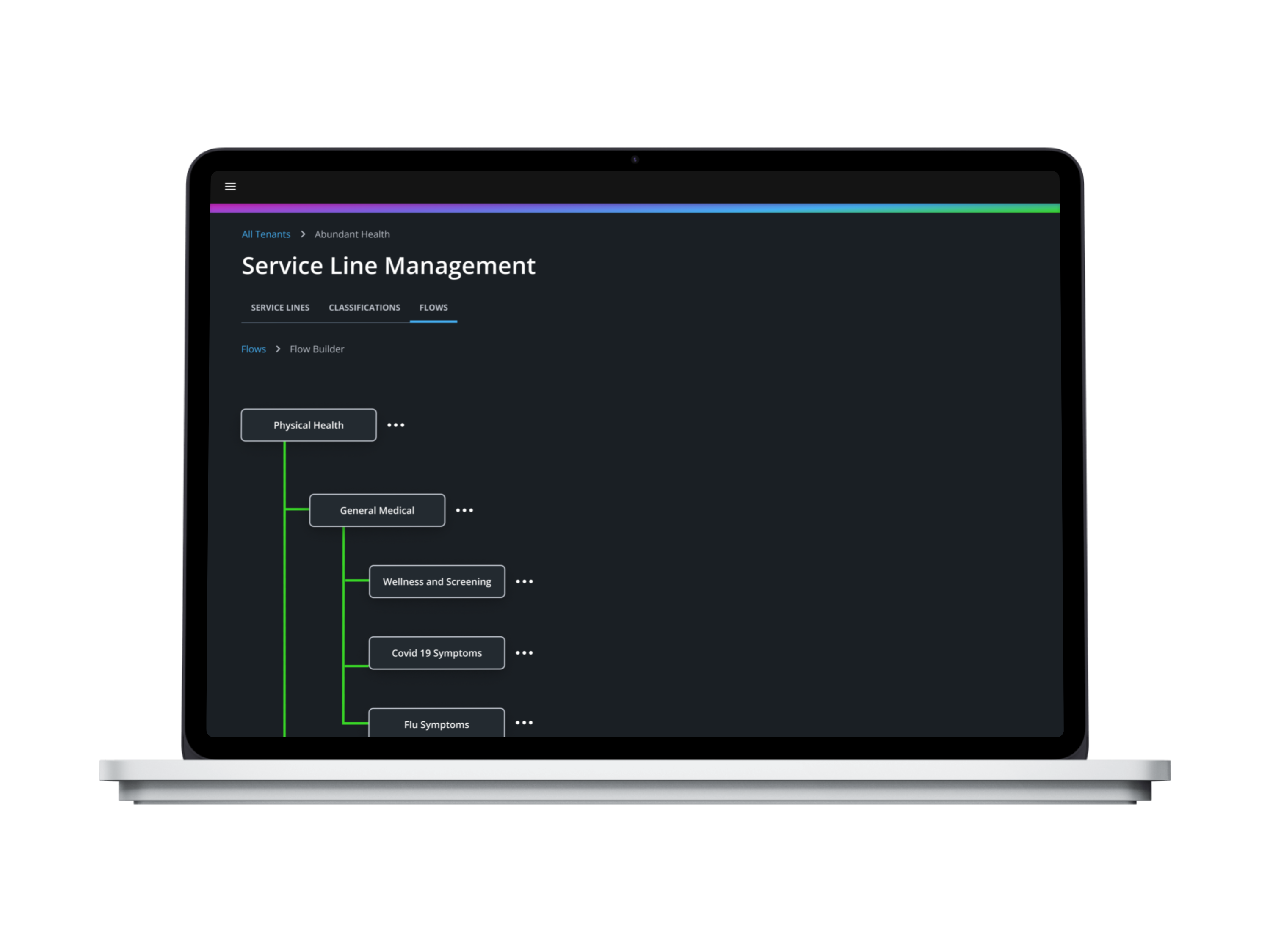
Create a multi-functional feature that allows you to create classifications, view classifications, and build flows.
.png)
.png)
Hypothesis
The introduction of a Classification feature that enables administrative users to create flows of existing healthcare services will enhance the user experience by improving the clarity, efficiency, and collaboration in managing and understanding complex healthcare processes.
User Interviews
Before making a Hypothesis, I needed to delve deeper into understanding the task at hand by speaking to users. Since there was no previous feature designed, I couldn't do a UX Audit and needed to understand how users were doing this, what their pain points were and their general thoughts surrounding Classifications. I put together a series of 6 different interviews with previous Admin users to understand their workflows better as well as their needs and pain points. Unfortunately my user panel for testing was limited by the restraints of user availability in the company. As well as, the information needed was too technical and too specific to users within the company to use sites like usertesting.com. During this time, I also extensively talked to my stakeholders to understand the Business Needs and had a collaborative working session to come up with real classifications for an actual client of ours to be able to do information architecture.
The key takeaways from user interviews are that:
1. People struggle to accomplish their work tasks in a timely manner because they have to navigate—and log into—multiple tools throughout the course of a day.
2. It’s difficult to find and understand configurations.
3. A lot of time is spent troubleshooting for providers, clients, and patients.
4. Most of Classification routing was done on the back end and needed to be diverted to Administrative teams in order to save resources.
Research Script


Site Map
Using the insights of my Research, I then created a Site Map. This Site Map is a rough landscape of my features. It allows me to get a gist of what the Informational architecture will look like. As well as, see potential issues of navigating the App.

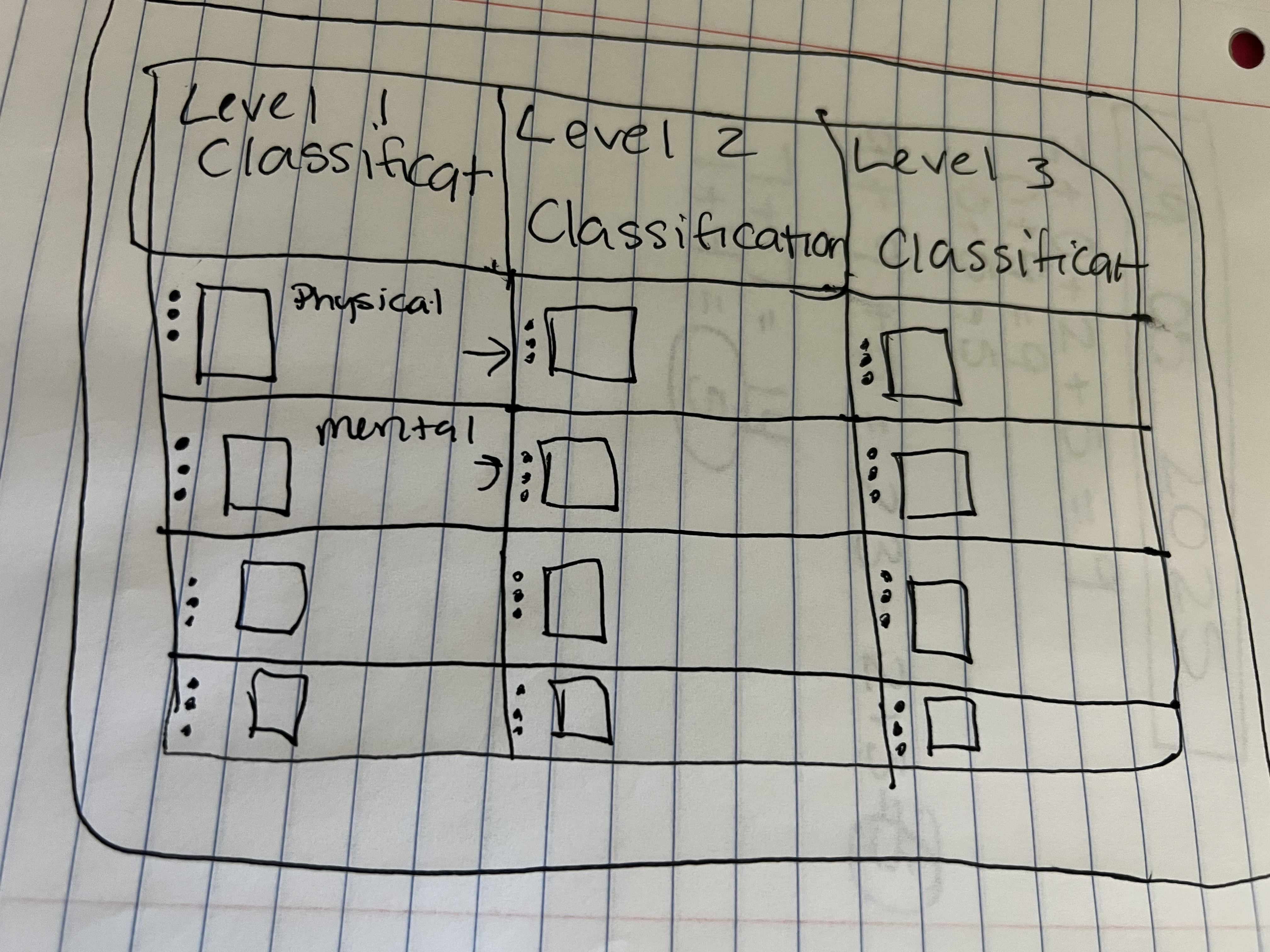
Sketches
After getting an understanding of my information architecture I began to sketch screens. This helped me to understand whether my ideas were tangible before moving on to wireframing.
Low Fidelity Wireframes
During this phase, I made an insane amount of wireframes. This was the most challenging part because I needed to not only meet user needs, but i needed to meet business needs, while also making sure the designs synced perfectly with back end technology. Reason being that this work needed to be designed so that the consumer experience could be set up for patients when configured by an Admin user. This is just a guess, but I went though 6 different rounds of iterations with testing and stakeholder review and made over 300 wireframes. The picture to the left is just one set of wireframes that went through review. My Figma file was so large, that it began to glitch by not allowing me to scroll to the left. 😂

High Fidelity Designs
High Fidelity Designs were made using a pre-existing design system. I did need to create a local component and propose the use case for it for all products to add to the design system. You can see more about this in my "flow builder" section underneath Visual Design.
Keeping my Hypothesis in mind, every single design choice made enhanced the user experience by improving the clarity, efficiency, and collaboration in managing and understanding complex healthcare processes. To go from manual configurations to using this feature Admin users across all departments are able to collaborate on this complex configuration and have visibility to service lines and flows with ease.

Usability Testing
Moderated Usability Testing
Usability testing is a critical phase in the design process as it provides crucial information about both design and function. Using moderated remote interviews, participants were asked to complete specific tasks using the developed prototype.
The primary goal here was to look for areas of confusion, to solve for any errors that might have been overlooked, and to gather feedback for usability improvement.
Users were asked to complete tasks specific to each Red Route:
- How would you search for a classification?
- How would you find a flow?
- How would you build a flow?
Users were also asked questions about the overall experience:
- What was most confusing about this feature?
- What do you like most about this feature?